Mastering the Art of Data Analytics: Five Trailblazing Strategies to Implement Today
The first step towards mastering data analytics lies in comprehending the types of data and identifying the right sources. There are two fundamental types of data—quantitative and qualitative. Quantitative data, often numerical, lends itself to statistical analysis. In contrast, qualitative data, encompassing everything from customer feedback to social media buzz, relies more on interpretive analysis. Data sources can vary immensely, from internal databases and customer surveys to web scraping and APIs.
Identifying the most relevant sources and types of data for a business context is paramount. For instance, a health insurance company might rely heavily on quantitative data from patient records and public health databases. A fashion retail brand, on the other hand, may prioritize qualitative data gleaned from social media trends and customer reviews.
It's also crucial to remember that different data types require different analysis tools and techniques. Using the right method for the right data is the basis for insightful analytics.
Unleashing the Power of Data Visualization

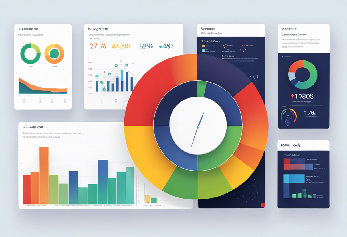
Visual presentation is a powerful tool for data exploration and communication. It helps quickly identify patterns and outliers, revealing the hidden insights within raw data. Infographics, heat maps, and dashboards are among the popular data visualization tools.
Data visualization is an iterative process where you translate newly analyzed data into visual format to facilitate easy comprehension and decision-making. There's also an art to choosing the right type of visualization – line graphs excel at showing trends over time, while pie charts provide a quick comparison of parts to a whole. The end goal is to present your data in a clear, concise manner that tells your story most effectively.